- A Despensa
- Porto
- Portugal
branding & packaging
a unique space with a unique atmosphere…
Areas
- Branding
Tools
- Adobe Illustrator
- Adobe Photoshop
share
The restaurant "A Despensa" is an Italian restaurant with Spanish influence and, most of all, with passion and curiosity for all the great dishes in the world.
In other words, a place with a welcoming atmosphere and a unique concept ...
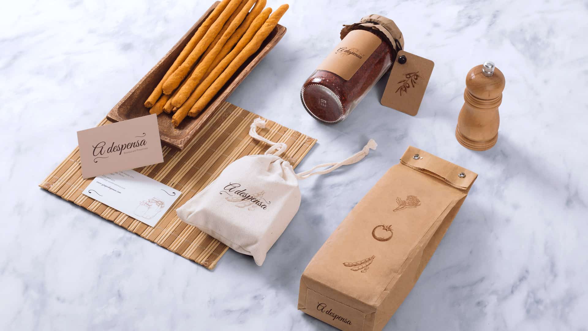
This new space located in downtown Porto, is divided into two. On one hand, we have the restaurant, with Italian / Spanish dishes and many Portuguese ingredients. On the other side, we have a section reserved for the sale of homemade preserves, a tradition that chef Daniel brought from the city of Puglia, in the south of Italy.

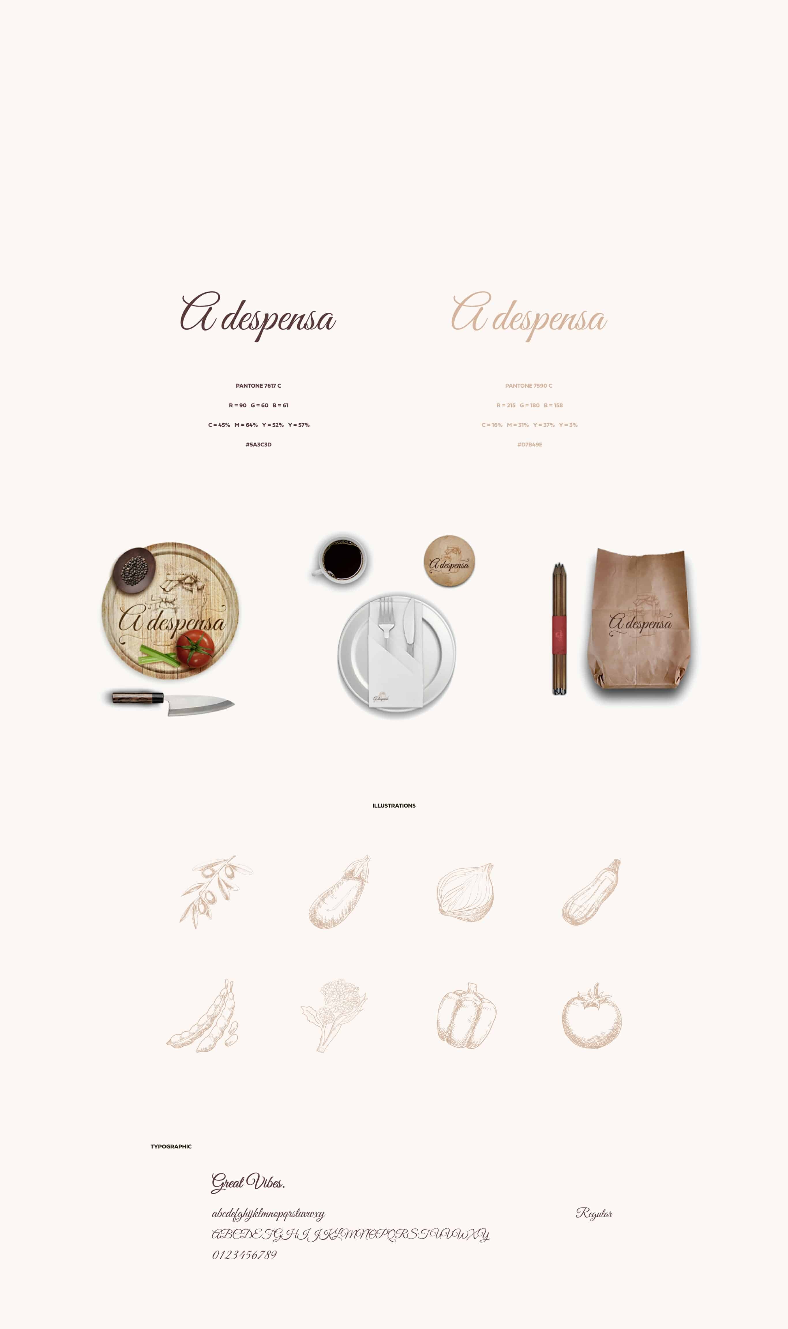
Typographically, the name of the restaurant was based on a very traditional, refined and serif line, in order to combine with all the other elements and supports where it would be applied.
We added some decorative and floral elements, highlighting the letter "A", to emphasize the idea that "A Despensa" is a unique restaurant.
On the other hand, we have developed a set of illustrations and elements that will always be present in the several media and all of the canned products sold.

