Color palette for colder times...
Inspired by the cold weather, we selected two distinct palettes that can get your creativity flowing.
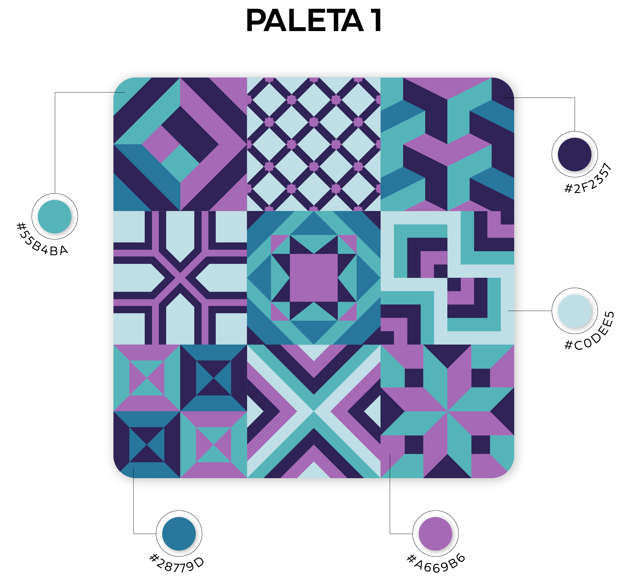
Palette 1
This palette contains shades from blue to purple. It is a vibrant palette with contrasting colors. We characterized it as versatile because we easily identify it in a technological theme, such as it can be used in floral themes, for example.

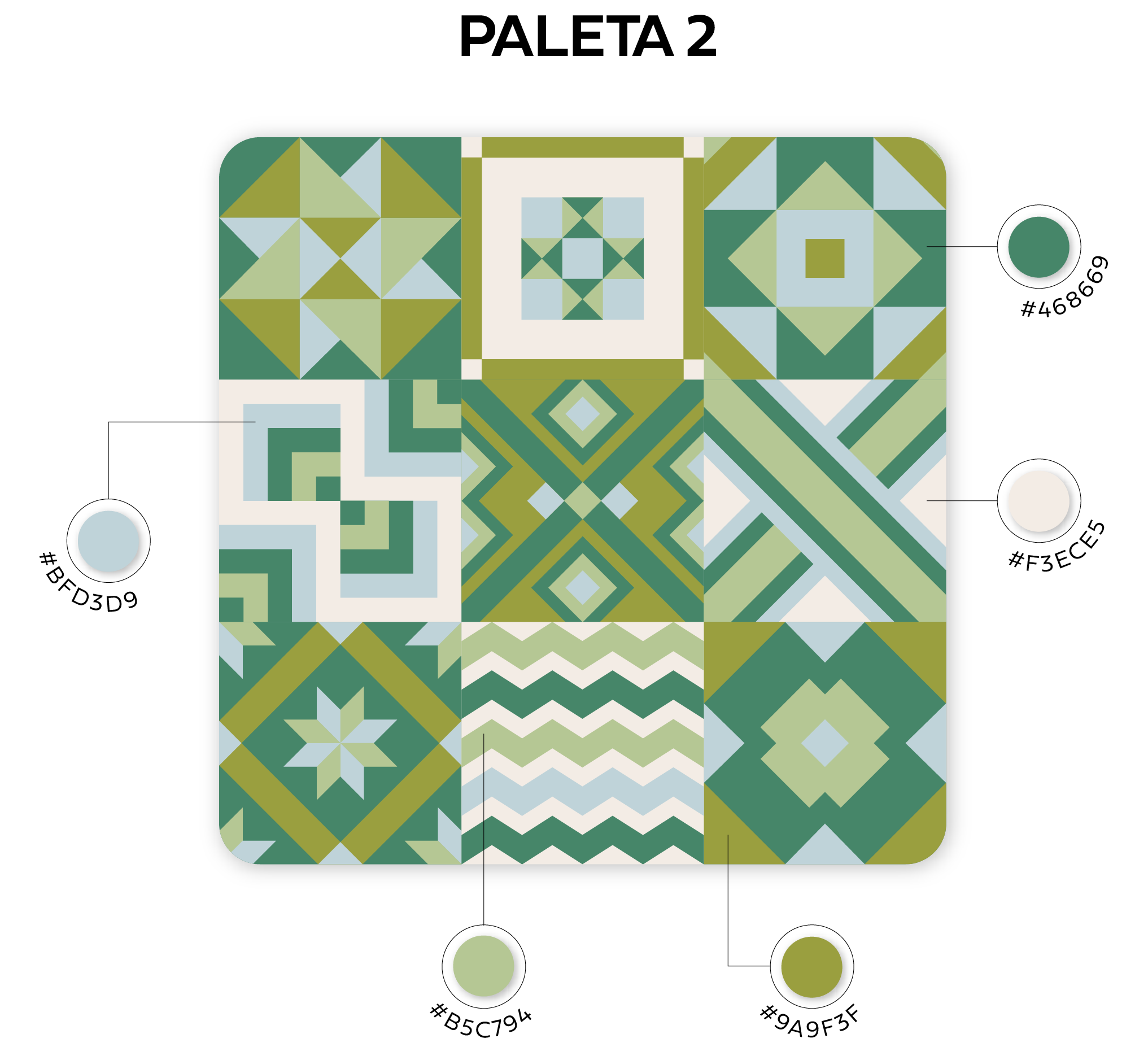
Palette 2
Palette 2, completely different from the first, represents cold tones more focused on green colors, with just a hint of blue. It conveys calm and tranquility due to the predominant greenery, but can also be applied to various contexts.

Cold color palettes for 4por4
Feeling that each client and project is unique, the priority is to meet the needs and desires of our clients, exceeding expectations.
And this is why, at 4por4, we have a creative team, specialized in website development, web design, online stores, corporate image, branding and communication supports that can help you boost your online presence and reach new horizons.
For 4por4, better than achieving is overcoming and surprising. Let´s walk together?