7 tips and advice for a good responsive design
Responsive design is the ability of a layout to adapt to any type of screen and interaction method.
Developing a good responsive design is very important, not only to maintain coherence between all media, but mainly for a good user experience.
We've put together some useful tips for building a good responsive design:
1 - Adjusting grids
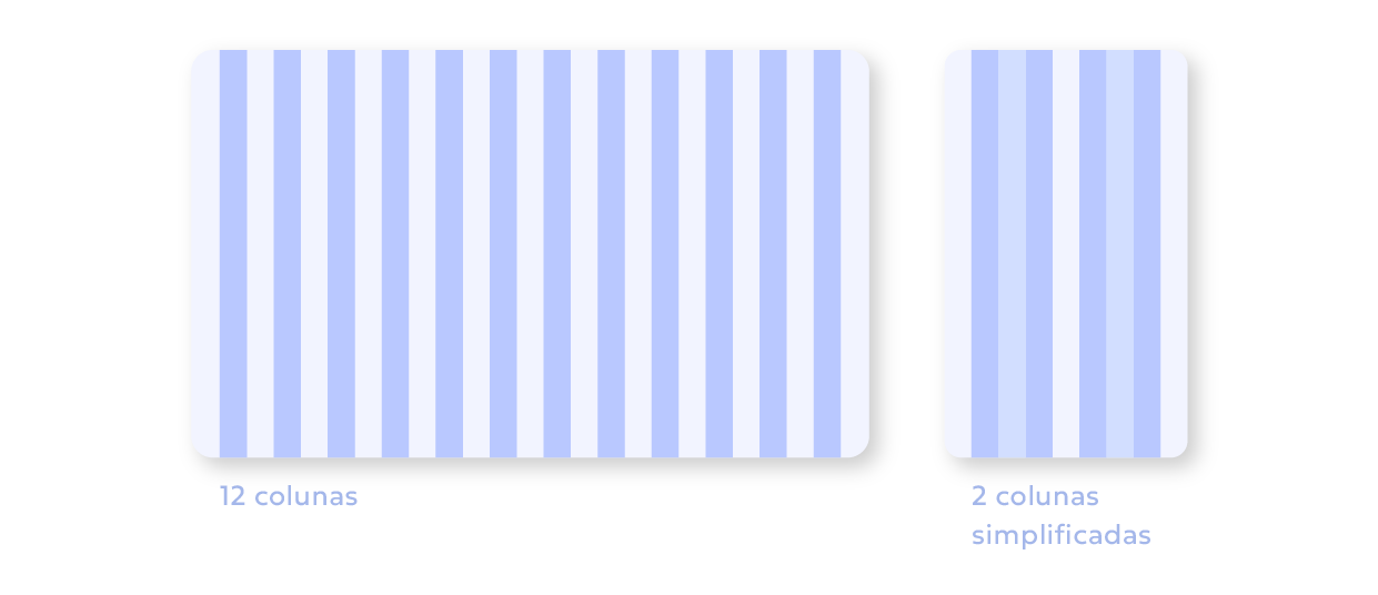
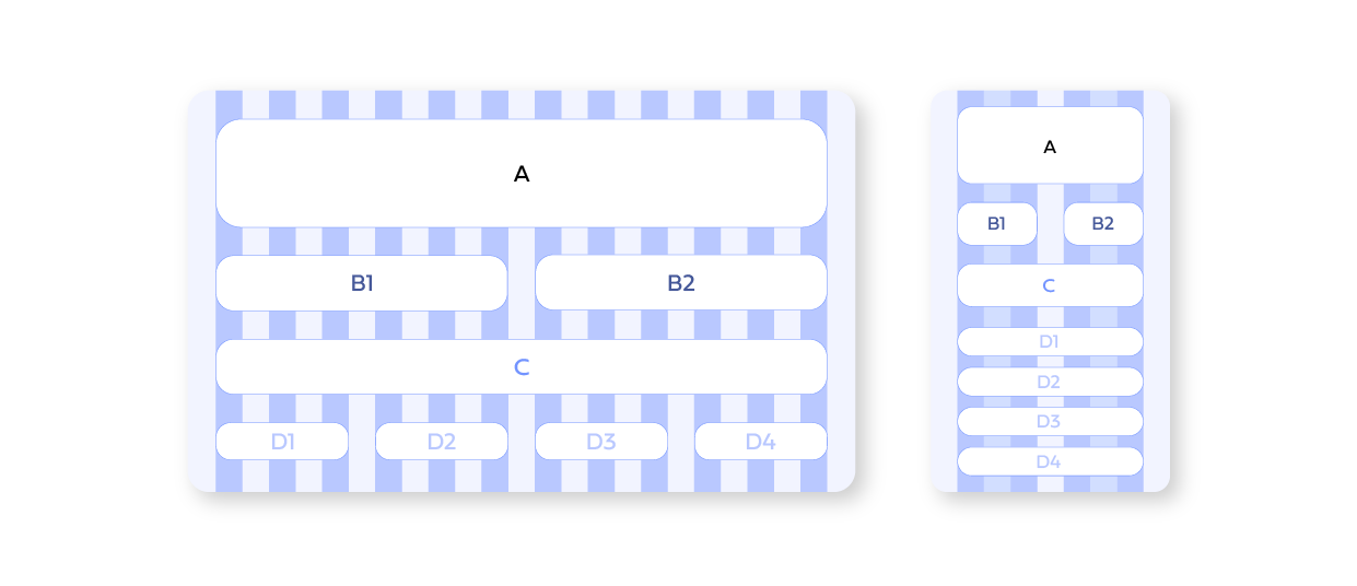
Grids allow you to have fixed columns, which will have their width adjusted according to the available space. The most common number is 12 columns, which is easily divided by 6, 3, 4 and 2 .
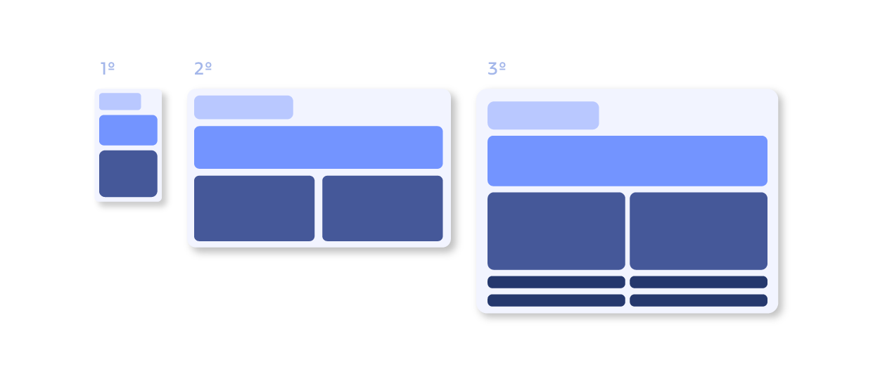
2 - Define your breakpoints
Breakpoints are the specific ranges of screen sizes where the layout readjusts to the available screen size to get the best possible layout view.
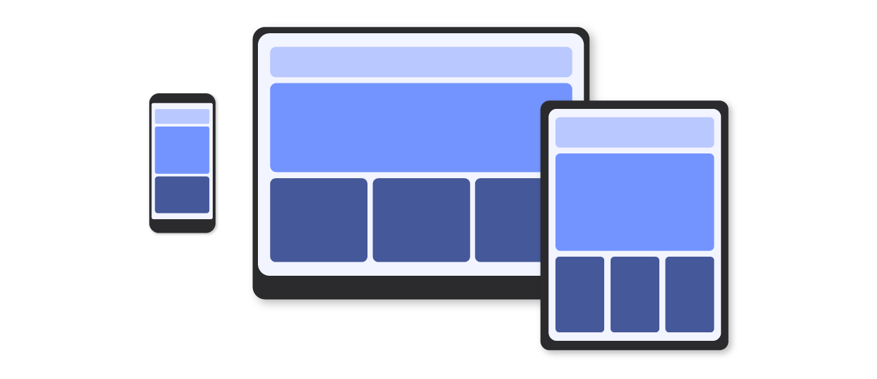
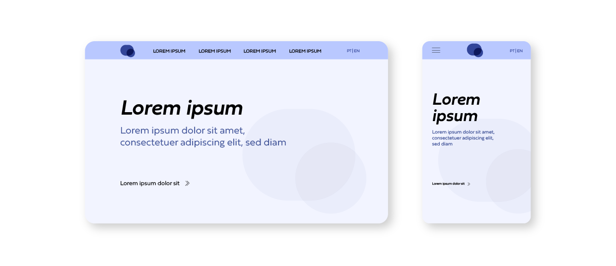
3 - Mobile design first
This process encourages you to start design development with the smallest layout (mobile). This way, unnecessary resources are reduced, as well as costs and time.
4 - Suitable image formats
The choice of image format must be considered according to its purpose. For example, the designer uses PNG for icons when developing the design, but the programmer uses SVG when developing the website, as it is a format that is more easily adjustable to any size.
5 - Responsive typography
The layout of a website depends a lot on its content, and typography plays a very important role and some points must be considered to obtain responsive typography:
- select a typography scale;
- define alignment and spacing;
- change fonts size by simply changing specific font size in HTML element.
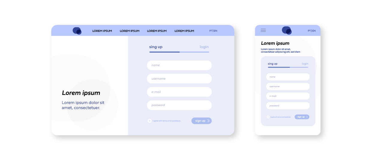
6 - Simple and intuitive forms
The larger the form, the more complicated it is to adapt it to different screen sizes, and the more difficult it is for the visitor to complete it to the end.
Forms should be visually appealing, clean and intuitive. A good tip is to try to include selection options.
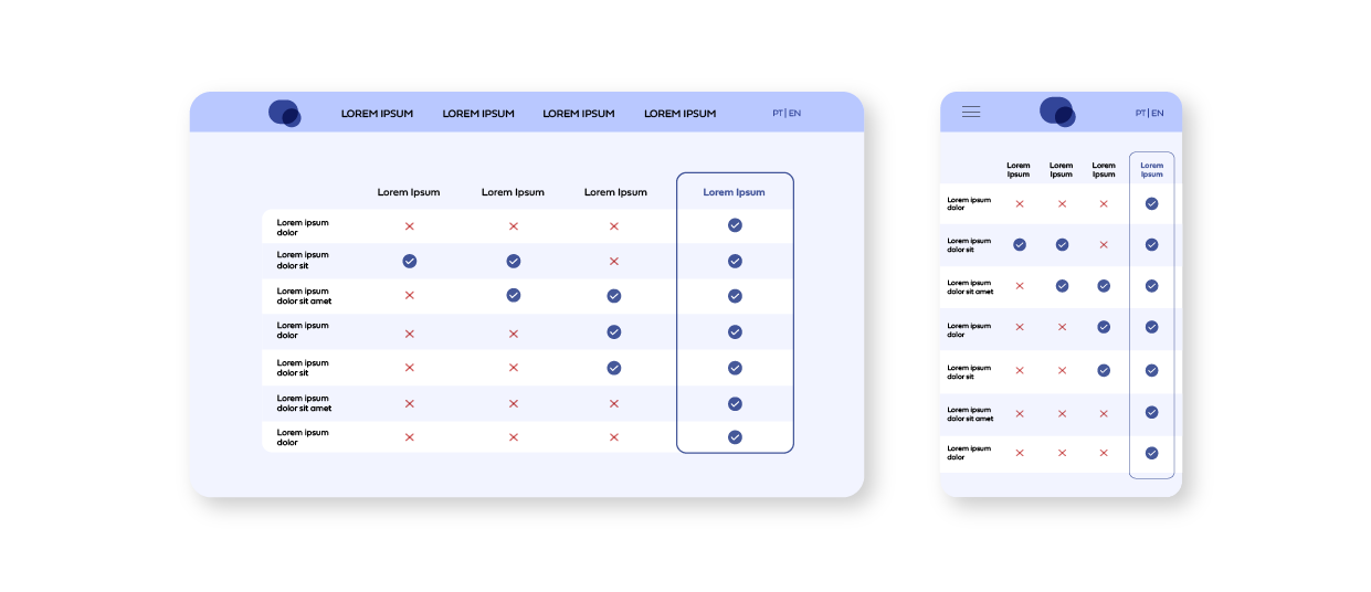
7 - Table organization
Most tables are organized in horizontal orientation, which complicates the process when transforming the layout to other sizes. It is an element that must be observed (and when necessary, changed) in smaller sizes, so that the information does not become illegible.
A practical solution is to hide the less important columns, letting the user choose what they want to view.
Conclusion
And that's why, at 4por4, we have a creative team, specialized in website development, web design, online stores, corporate image, branding and communication supports that can help you boost your online/offline presence.
Do you already know and use any of these tips? Share your experience with us!
For 4por4, better than achieving is overcoming and surprising. Let´s walk together?
got a project? we´d love to know a little more….

